Mapping Destruction—A Conversation with Jamon Van Den Hoek of Conflict Ecology
Changing scales of conflict and advances in satellite imagery are reshaping how damage is assessed.
Changing scales of conflict and advances in satellite imagery are reshaping how damage is assessed.
Satellite imagery has become central to documenting destruction in contemporary wars. For MER’s winter issue on reconstruction, editor Deen Sharp interviews Jamon Van Den Hoek, associate professor of geography at Oregon State University and director of Conflict Ecology: a research hub that uses satellite imagery and geospatial analysis to track land-use change, forced displacement and conflict damage across the globe. The lab’s work has informed public understanding of the scale and speed of destruction in Gaza, Ukraine, Sudan and beyond. Their conversation, which took place via zoom in December 2025, explores the lab’s methodological toolkit, the politics of satellite access, what can (and cannot) be seen from space and the challenges of interpreting conflict damage in real time. It has been edited for length and clarity.
Deen Sharp: Could you start by introducing your own intellectual background and telling us about Conflict Ecology—where it's situated, and the sorts of work that it does.
Jamon Van Den Hoek: I did my PhD in geography, but I came to that discipline via civil engineering and archaeology, so I got involved with GIS and remote sensing during my master's degree. I transitioned into this geographic area of inquiry where we still use large-scale satellite remote sensing approaches and geospatial analysis, but instead of looking at engineering applications, we look at things like long-term landscape change in conflict settings, environmental degradation in refugee settings, climatic risk in refugee settings.
Conflict Ecology has two main programs. First, the sort of acute, immediate damage detection and conflict impact assessment—urban, agriculture, forest ecosystems—and the long-term implications of those damages in conflict settings. But we also have the real long-term work: After people are displaced and then they're living in new settings for generations, what are the conditions there? What are the vulnerabilities, the exposures? What are the policy barriers to having safer livelihoods, more meaningful livelihoods? It's very interdisciplinary work. We work with people from different backgrounds—fieldwork, qualitative data, participatory mapping, satellite image analysis—all of these are used at one time or another. Mainly, though, our bread and butter is satellite imagery and geospatial analysis.
Deen: The lab’s work has been widely publicized and has led many of the public-facing analyses of the destruction in Gaza and also Sudan. But before we go into more details, in simple terms for non-experts, can you break down some of the methodological tools, the satellite imagery that you use, how you use it? It's not just looking at high-quality resolution images. You've got a lot of different tools that I don't think non-experts will be very familiar with.
Jamon: The reference point is the use of very detailed, sub-meter (50 centimeter, 30 centimeter) high-resolution satellite imagery taken overhead. This is the kind of imagery that serves as the base map on Google Maps or Apple Maps. The analogy often used is that you should be able to see a dinner plate from space with this imagery. In any kind of satellite imagery analysis, you exploit not just the size of things—the small pixels are good— but it's that contrast. You need some sort of spectral differentiation. If everything is camouflaged, you're not going to see anything, no matter the resolution. Optical satellite imagery, the more traditional imagery, uses red, green and blue bands to show an image our eyes can interpret. These images also have other bands, usually a near-infrared and then a mid-infrared. Some systems have thermal sensing, commonly used for wildfire detection. These other bands are sensitive to different regions of the electromagnetic spectrum, particularly to environmental systems like vegetated landscapes, urban settings, water quality and atmospheric conditions. That's one of the mainstays of environmental remote sensing.
We also use radar imagery: synthetic aperture radar, or SAR. With SAR, we're not looking at colors, which are really a result of chemistry, like whether you have chlorophyll in a leaf. Rather, we're looking at the texture, the configuration, the arrangement and the location of features on a landscape. Some of the most commonly seen examples are earthquake damage detection: those maps where you see the rippling effect of the shock wave going out and disturbing the ground. Those are usually radar-derived images. The system is sensitive to movement and elevation of the ground to a sub-centimeter level. We can use these same systems to detect damage to buildings, forest canopies and agriculture. It's not literally 3D mapping—that would be LIDAR, like what self-driving cars use—but it's sensitive to movements and redistributions of features in space. Even leaves moving in a tree canopy can be detected. It's a very different way of looking at the environment and much less intuitive. It's tough to read these images.
And an added challenge now is we cannot just look at a single image. We have wars that last years, so we're not just taking one image after one attack or one earthquake. We're taking images every week for years. We can't do visual interpretation of every single image and every single location. That's impossible. We have to develop automated approaches. For the urban damage work, done in collaboration with Corey Scher, a postdoc in our lab, we use time series methods where we construct long periods of imagery and trace disturbances. We identify anomalous changes, deviations from what we expect that image to look like. All of our methods come down to detecting changes that shouldn't have been there unless some disturbance occurred, like a building being damaged.
Deen: Obviously Conflict Ecology doesn't own satellites. You're relying on either government providers or the private sector. How does that access work? How much is open source? How much do you have to purchase? What are the obstacles—not just financial, but presumably security-related as well?
Jamon: There are dozens of commercial satellite image providers around the world: in the US, the EU and increasingly outside these two long-standing commercial centers. These systems tend to be higher spatial resolution, very detailed imagery. We've had high-resolution commercial imagery since 1999, but really, it's just the last decade that we've had full coverage. These systems come at a cost: some amount of dollars per square kilometer. They're not usually collecting everywhere every day. You often have to task them, put in an order. And the next time the satellite goes overhead, it gets an image for you. One challenge in conflict settings is you just don't know what you're going to get and when. Do you have an image before the conflict started that you could compare it to? Some of our work now is trying to understand where we even have suitable pre-conflict baselines.
These restrictions limit not just academics like us but actual real-time humanitarian decision-making.
There are more severe cases of restrictions called embargoes, where someone else has already purchased imagery over a certain location during a certain period. We don't know who's making these orders, but the broad assumption is that defense or intelligence communities have standing purchase orders with providers where they basically say: Whatever image comes out over a conflict area, that's exclusively ours. That's happened in Ukraine, in Gaza and other places. These restrictions limit not just academics like us but actual real-time humanitarian decision-making. When there's a crisis and you need to identify roads that have been washed out or corridors on fire, there can be a chokepoint where you're told, “Sorry, we cannot give you the imagery.”
Palestine and Israel are also unique because for many years there was a US amendment called the Kyl-Bingaman Amendment, which restricted US commercial providers from selling satellite imagery over Israel and Palestine for security reasons. That amendment was eventually dropped because so many other providers, mainly in the EU, were serving up imagery anyway. But that meant there was a blank spot on the map, very outdated imagery for Gaza, the West Bank and Israel for many years.
Our approach is to use open data from the European Space Agency (ESA) and NASA. We get around a lot of these issues, but really what we want to do is make these products a public good. We want to open up these approaches and the source data so anyone can run them or access the source imagery. That increases transparency and the opportunity to verify and cross-check different approaches. The systems we use have been going around the clock for the last decade, collecting extremely high-quality data everywhere, every week. Even if you're just working with radar or optical systems, there's a lot of value in bringing in contextual imagery to understand not only what was there before the conflict but what conditions affect your ability to detect damage.
Deen: Let's get into your work on Gaza. Can you explain the types of data you've been using, the access to data and then the research you've been doing?
Jamon: Prior to October 2023, I had worked on the 2014 war with Amnesty International and Forensic Architecture—a totally different era of mapping this. Coming back to Gaza every few years and looking at damage from different satellite perspectives was really beneficial in setting us up to quickly deploy a damage detection approach sensitive to the conditions we saw unfolding after October 2023. Working with Corey Scher, we have used open Sentinel-1 radar datasets: the workhorse radar system from the European Space Agency. We basically looked for stability in urban settings where buildings have not changed over a long period of time before the war. Then once the war started, we got new images and looked for meaningful change: acute, immediate, sustained changes in buildings and the urban fabric.
The speed and extent of damage caught us off guard. We had no expectation this would be a more than two-year monitoring effort. We're still mapping post-ceasefire damage in Gaza no
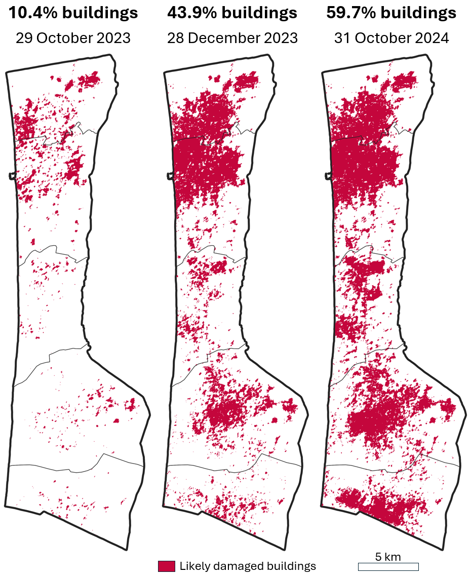
We had the first public release of damage detection in Gaza within seven days of the war starting. We tracked this every week for the first year. Most of the damage occurred in those first three months. By December, every governorate had already had over 50 percent of its damage detected—an extremely rapid war. The use of artificial intelligence to identify targeting sites, the sheer number of bombs dropped every day have been well-documented by other groups. We saw the map of damage grow and grow. Corey has used the term “metastasized” to describe this spatial accretion of visible change. We had to change how we did our mapping approach because the actual map became consumed by damage. Where we had labels for governorate names, those had to be shifted because so much of the region was eventually damaged. The speed and extent of damage caught us off guard. We had no expectation this would be a more than two-year monitoring effort. We're still mapping post-ceasefire damage in Gaza now.
We worked a lot in those first two months, kind of night and day, to get the framework set up so we could quickly deploy as soon as an image was available. Our fastest was four hours. We would send updates to a global community of journalists and humanitarians, about 250 people around the world. A lot of those maps made their way into media coverage, humanitarian reports and different high-level UN reporting. We also work with colleagues in the Decentralized Damage Mapping Group, which we started coincidentally two months before the war in Gaza. Working with people like He Yin, Lina Eklund and others, we've developed approaches to map agricultural damage, water, sanitation and hygiene infrastructure damage (led by Brian Perlman) and waste management (through Wim Zwijnenburg and Marie Schellens’ work with the peace organization PAX).
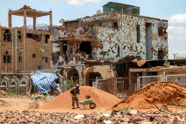
Every single facet of life has been affected in Gaza sometimes in ways that are detectable from space. Population movement, tent placement, mobility restrictions, the yellow line, roads constructed by the IDF throughout—it's such a complete transformation of the landscape. A lifetime of academic inquiry could go into these things, and that's not even speaking of all the stuff we can't see from space: the personal impacts, the loss of life and limbs, children not going to school for over two years. We've gotten questions like: Can you find the bakeries that have been destroyed? We never would have thought of that question, but it obviously really matters.
Deen: When it comes to Gaza, the validity of data is constantly questioned. On the point of competing damage assessment maps, has there been an issue with people producing other analyses and questioning your data?
Jamon: The big issue is that there's a UN group, UNOSAT, that's the de facto damage mapping team and has been for years. They use very detailed imagery and do visual interpretation—not flawless, with known cases of errors, but really good work all the same. It's different from our approach for various reasons. For example, they tend to examine damage in a few cities at one or two points in time, while we conduct nationwide mapping about every week of a conflict, which may last years. There's still deference to the UNOSAT dataset in a lot of end-user communities. But when we have a map that looks similar but different, we have examined those differences for agreement and disagreement. Where we disagree, why? We need to understand what that gap is. The Humanitarian OpenStreetMap team just put out a very good report looking at damage detection over Lebanon that examines seven different assessments with pretty wildly different results. The truth is probably somewhere in the middle. We must figure out how to communicate the reasons for disagreement.
When the difference is in percentages, that's just relative to the count of buildings. If your reference dataset on buildings that were there pre-war differs, your percentages will differ too. This is the reality in Gaza: We have an exhaustive database from the Humanitarian OpenStreetMap Team with many thousands more buildings. So even though we agree about the number of buildings damaged, the percentages others offer are much higher because they have fewer buildings to begin with. 80 percent versus 60 percent is a big difference. A journalist who wants that headline, which one are they going to use? Humanitarians looking for attention and advocacy, which will they use? We try to be very conservative in our work. Part of that is understanding where the sources of disagreement come from.
Deen: I want to point out the contrast in access to satellite imagery between Gaza and Sudan. From what I understand, the Sentinel satellite somehow got knocked out or wasn't available, so the open access data you had for Gaza wasn't available for Sudan.
It seems that these European system images prioritize collection over Europe. American and Chinese systems do this too, but usually the difference is imperceptible. In this case, we saw very clear gaps over a stretch of Africa, which included Sudan.
Jamon: That's exactly right. When the most recent war in Sudan was starting, specifically the intense localization of damage in Khartoum, we were thinking about turning the lens there. Lo and behold, there was basically no pre-war, pre-conflict imagery available from the system we usually use. Our whole framework relies on this deep history of coverage, and that was gone. We don't have a full explanation. The gap was there before the war. It seems that these European system images prioritize collection over Europe. American and Chinese systems do this too, but usually the difference is imperceptible. In this case, we saw very clear gaps over a stretch of Africa, which included Sudan.
It could be that space was being saved on the local hard drives of these satellites to collect over Europe, then they downlink to a ground-receiving station. We've seen similar patterns with 1980s and 1990s coverage by NASA systems: broad blank spots outside of downlink areas. That limited our ability, so we had to pivot to commercial systems. One radar image provider had actually used Khartoum damage as a demo on their company website. We were able to bootstrap other data, but at the cost of not having full coverage over time and space. Our work was really localized on Khartoum.
Deen: With El Fasher recently, a lot of evidence came from satellite imagery. But there have been instances of misinformation or misapplication. There were cases where analysts were pointing out areas that clearly had an animal slaughterhouse, mistaking it for a massacre. To what extent is the opening up of satellite imagery and analysis causing confusion?
Jamon: Right, understanding the spatial setting can be so difficult to do from satellite imagery alone. We often lack information on how a patch of land is used outside of wartime, and whatever that use is could change dramatically during wartime. In the case of El Fasher, a satellite image recently went viral where the original poster incorrectly suggested that an image showed dozens of human bodies lying on the ground when in fact the image only showed cattle gathering around a tree. The image wasn’t even taken during the war but rather goes back to 2022. Nonetheless, the social media attention towards the false claims made around this image was probably greater than any other news about the actual massacres in El-Fasher that have been well documented by the Yale Humanitarian team and others.
Some people who look at these images might assume they're truthful and a reasonable stand-in for being at that location, but we all know that's not true. If there's any sacrosanct term in remote sensing, it's “ground truth:” What is actually there when the image was taken. In forest mapping and ecological monitoring, ground truth isn't just going to a place and saying “it's a tree.” You do extensive statistical, spatially explicit analysis. You need to account for context, time of day, what happened before, what seems to still be there. That kind of rigor is usually impossible in conflict settings and also often impossible in post-conflict settings where access is often restricted. People get in, but usually not people who say, “I'm going to do a ground truth survey with a statistical sampling approach.” The satellite view and the ground view are usually siloed, despite often being proxies of one another. We need to better communicate the limitations of these images.
Deen: Finally, what are the current frontiers of your work? Looking ahead, are you optimistic about the future of geospatial science?
Jamon: One of the frontiers is scaling our damage mapping work across multiple armed conflicts around the globe so that we can have consistent data on the amount, speed and type of war damage. My hope is that this kind of approach will provide greater measures of accountability, especially in cases of civilian harm and in places with little media attention.
I’m extremely optimistic about where the field is going. It’s still driven by technological advancements in many respects, but we’re increasingly seeing deeper collaboration across disciplines and with humanitarian partners and a stronger commitment to centering the questions that matter most to affected communities—not treating local concerns as an afterthought but as a starting point for analysis.
Support MERIP in providing critical, grounded reporting and analysis without paywalls. Make a one-time or monthly donation today!